Dialogs
The v-dialog component inform users about a specific task and may contain critical information, require decisions, or involve multiple tasks. Use dialogs sparingly because they are interruptive.
Usage
In this basic example we use the activator slot to render a button that is used to open the dialog. When using the activator slot it is important that you bind the props object from the slot (using v-bind) to the element that will activate the dialog. See the examples below for more ways of activating a dialog.
API
| Component | Description |
|---|---|
| v-dialog | Primary component |
| v-overlay | Extended component |
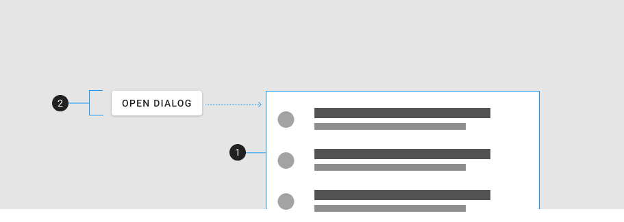
Anatomy
The recommended components to use inside of a v-dialog are:
| Element / Area | Description |
|---|---|
| 1. Container | The dialog's content that animates from the activator |
| 2. Activator | The element that activates the dialog |
Guide
The v-dialog component is used to inform users about a specific task and may contain critical information, require decisions, or involve multiple tasks. They are controlled by a v-model and/or an activator.
Props
The v-dialog component extends v-overlay and has access to all of its props.
v-model
You can also trigger a dialog by simply updating the v-model, without using either activator slot or prop. In this case, the dialog will not appear to be activated by any specific element, and will simply appear in the middle of the screen.
Persistent
Persistent dialogs are not dismissed when touching outside or pressing the esc key.
Transitions
You can make the dialog appear from the top or the bottom.
Nesting
Dialogs can be nested: you can open one dialog from another.
Overflowed
Modals that do not fit within the available window space will scroll the container.
Slots
The v-dialog component has 2 slots, activator and default. The activator slot is used to designate an element that will activate the dialog. The default slot provides an isActive ref which is tied to the current state of the dialog.
Activator
In addition using the activator slot, we can instead use the activator prop to activate a dialog. By placing the dialog component inside the button, and setting the activator prop value to "parent" we can designate the parent (button) as the activator.
Default
Examples
The following are a collection of examples that demonstrate more advanced and real world use of the v-dialog component.
Scrollable
Example of a dialog with scrollable content.
Form
A simple example of a form in a dialog.
Loader
The v-dialog component makes it easy to create a customized loading experience for your application.
Fullscreen
Due to limited space, full-screen dialogs may be more appropriate for mobile devices than dialogs used on devices with larger screens.
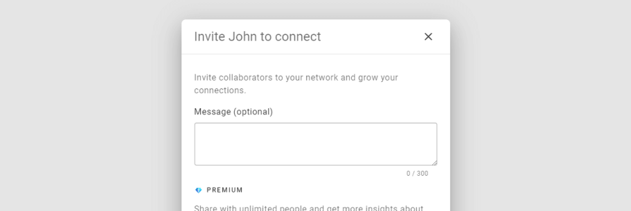
Invite dialog
This example demonstrates a dialog that is used to invite users to a group.