Chips
The v-chip component is used to convey small pieces of information. Using the close property, the chip becomes interactive, allowing user interaction. This component is used by the v-chip-group for advanced selection options.
Usage
Chips come in the following variations: closeable, filter, outlined, pill. The default slot of v-chip will also accept avatars and icons alongside text.
API
| Component | Description |
|---|---|
| v-chip | Primary component |
Guide
The v-chip component is used to convey small pieces of information. Using the close property, the chip becomes interactive, allowing user interaction. This component is used by the v-chip-group for advanced selection options.
Props
Similar to other components such as v-btn and v-list, the v-chip component has a large selection of props for customizing the appearance.
Closable
Closable chips can be controlled with a v-model. You can also listen to the click:close event if you want to know when a chip has been closed.
Color and variants
Any color from the Material Design palette can be used to change a chips color.
The variant prop gives you easy access to several different button styles. Available variants are: elevated, flat, tonal (default), outlined, text, and plain.
| Value | Example | Description |
|---|---|---|
| elevated | Chip | Elevates the chip with a shadow |
| flat | Chip | Removes chip shadow |
| tonal | Chip | Background color is a lowered opacity of the current text color |
| outlined | Chip | Applies a thin border with the current text color |
| text | Chip | Removes the background and removes shadow |
| plain | Chip | Removes the background and lowers the opacity until hovered |
Size and density
Chips can have various sizes from x-small to x-large. density is used to adjust the vertical spacing without affecting width or font size.
Draggable
draggable v-chip component can be dragged by mouse.
Label
Label chips use the v-card border-radius.
No ripple
v-chip can be rendered without ripple if ripple prop is set to false.
Outlined
Outlined chips inherit their border color from the current text color.
Slots
Icon
Chips can use text or any icon available in the Material Icons font library.
Examples
The following are a collection of examples that demonstrate more advanced and real world use of the v-chip component.
Action chips
Chips can be used as actionable items. Provided with a click event, the chip becomes interactive and can invoke methods.
Custom list
In this example we opt to use a customized list instead of v-autocomplete. This allows us to always display the options available while still providing the same functionality of search and selection.
Expandable
Chips can be combined with v-menu to enable a specific set of actions for a chip.
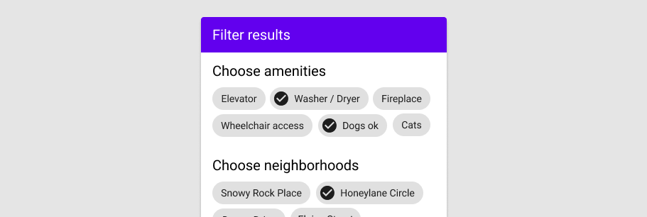
Filtering
Chips are great for providing supplementary actions to a particular task. In this instance, we are searching a list of items and collecting a subset of information to display available keywords.
In selects
Selects can use chips to display the selected data. Try adding your own tags below.