System bars
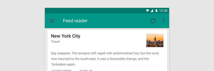
The v-system-bar component can be used for displaying statuses to the user. It looks like the Android system bar and can contain icons, spacers, and some text.
Usage
v-system-bar in its simplest form displays a small container with default theme.
API
| Component | Description |
|---|---|
| v-system-bar | Primary Component |
Anatomy
The recommended placement of elements inside of v-system-bar is:
- Place informational icons to the right
- Place time or other textual information to the far right
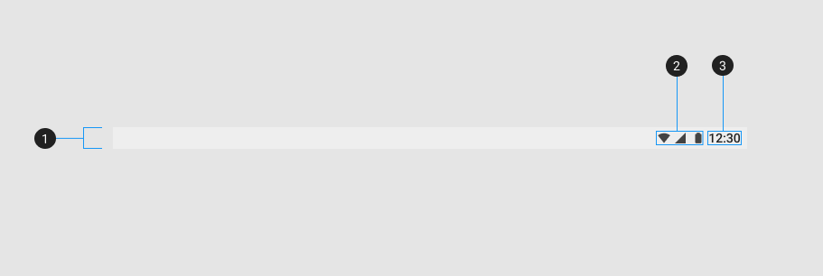
| Element / Area | Description |
|---|---|
| 1. Container | The System Bar container has a default slot with content justified right |
| 2. Icon items (optional) | Used to convey information through the use of icons |
| 3. Text (optional) | Textual content that is typically used to show time |
Examples
Props
Color
You can optionally change the color of the v-system-bar by using the color prop.
Window
A window bar with window controls and status info.